YouTube does a lot of things well, and most of the time it’s a handy way to get a video on your website. One area where they fall short, is the way embedded videos look. As designers, we spend a ton of time making sure a web site looks great, then BAM! embed a video and it all goes to hell. Colors, controls, fixed widths, and settings (like showing related videos of your competition at the end of a video) all conspire to ruin a beautiful thing.
The standard YouTube embed looks like this:
Fortunately, there are ways to modify the way embedded videos look and function. The only thing we can’t do with YouTube parameters is make the video embed responsive, but that can be handled with some clever CSS (Here’s a post by Rachel McCollin that will explain how to make iframes responsive).
Another key detail to make YouTube videos look great
It would be lame to go through all the trouble to make your embedded YouTube player look good, then roll with the standard cover image that YouTube selects. Make your own custom cover photo. Not only will it look better, but it’s also an opportunity to include additional information like titles, a call to action, and your own branding.
Skip the details
If you don’t care why it works and just want the code to make it look good, add this text string to the end of the src url: ?modestbranding=1;controls=0;showinfo=0;rel=0;fs=1
With the modified YouTube video parameters
This will hide everything and give you the cleanest looking embed by hiding the controls, eliminating the video title from the header, and removing the related videos from the end.
For those of you that like to know why
There are lots of parameters YouTube provides that allow us to modify the way videos function and are displayed, but there are 5 in particular that will handle most of what you’ll use. A complete list can be found here: https://developers.google.com/youtube/player_parameters
One last thing
One last note before diving in to the parameters; there are two important connectors that need to be included for this to work. First, you must add a ? after the last character of your url before adding the parameters. Second, separate each of the parameters with a ;. For example, the standard url for our Hosting Deficiency Syndrome Video is: www.youtube.com/embed/CFHW7jkQsZc,
to that we added the string: ?modestbranding=1;controls=0;showinfo=0;rel=0;fs=1,
giving us a combined string that looks like this: www.youtube.com/embed/CFHW7jkQsZc?modestbranding=1;controls=0;showinfo=0;rel=0;fs=1
The Big 4
Now for the parameters, with a brief explanation of how each one works. Modest Branding – This parameter controls the display of the YouTube logo. The options are 0 or 1, we almost always set it to 1. modestbranding=1 Controls – This parameter indicates whether the video player controls will display. Our options are 0, 1, or 2. Default is 1. We almost always change it to 0. If you have a video where you want the viewer to have more control leave this at 1. controls=0 Show Info – This parameter controls the display of information like video title and uploader. Value options are 0 or 1, set the value to 1 to remove the information from the video. showinfo=0 Related – This parameter indicates whether the player should show related videos at the end of your video. If you have a lot of related content, sometimes this is a good idea. More often than not it will display videos from other YouTube users, you’ll have to decide what is best for your situation. rel=0
In Closing
Whether you just want the code or the particulars, fixing how your YouTube videos are displayed goes a long way to keeping your website looking great. Hopefully this info will help make your YouTube video embeds more attractive and suck less.
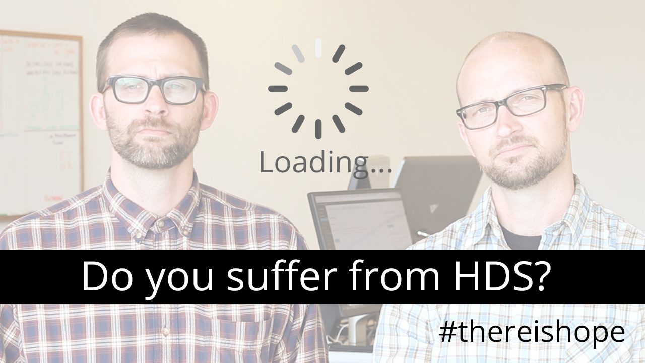
Hosting Deficiency Syndrome (HDS) is a serious problem plaguing the WordPress community. Symptoms include slow page load times, the need for caching plugins, poor security, out of date WP installations, terrible customer service, and more.
Fortunately there is hope.
The treatment for HDS is Managed WordPress hosting from www.GetFlywheel.com. Their dedicated team of hosting professionals will migrate your site for free and have your website operating better in no time.
If you, or a company you know suffers from HDS, please contact them today.
About Flywheel
Flywheel is an amazing WordPress hosting company based in Omaha, Nebraska (AKA The Silicon Prairie). They do an awesome job of managing WordPress hosting for design firms like us at Workshed.com. If your website is built on WordPress, check them out (Also they do free migrations, which is very, very, helpful). CONTACT FLYWHEEL
About Workshed
We approach design, marketing, and websites from a business owners perspective. Sure, we love cool tech just as much as the next geek, but we know that providing solutions to real business problems is a better way to provide value.
Back when I first started as a financial adviser, Van Kampen mutual funds was doing a big ‘value add’ push to attract more business. I’m not sure how successful their effort was for them, but one of the positive outcomes I received was an introduction to their office audit (along with a few books like “Storyselling for Financial Advisers” and “Millionaire’s Advisor“) which helped advisers understand the non verbal messages an office can communicate to clients and prospects. The typical suggestions usually consisted of things like “remove clutter,” “add pictures of family,” and “display your hobbies.” All of which were intended to instill confidence and make connections. The same is true (perhaps more so) of your website.
Here are a few questions to help you conduct an audit on your firm’s website:
How often to you add content?
Is the content written by you or someone at your firm?
Does your home page answer the WIFM question for prospects?
Is your website build to be search engine friendly?
How does your website look on a mobile phone or tablet?
Financial Advisor Websites Audit
Pull up your website and pretend it’s one of your competitors. If you were looking at it for the first time what would it say about you and your company? Does it help someone learn anything meaningful about your firm or differentiate you from all the other advisors out there?
Write down your answers to these questions. Have your staff do the same. Unless your answers were weekly, yes, yes yes, and great, there is room for improvement. Enhancements to anyone of these areas can lead to significant improvement in the conversion of visitors (or getting more visitors) into clients.
In reality there are many factors that go into building great looking, high performing financial advisor websites, but by starting with these 5 you’ll have an advantage (assuming you do something after asking the questions) over your competition. I’d also recommend reading Storyselling for Financial Advisers and Millionaire’s Advisor, they are great books that will help you connect with clients and run your practice more efficiently.
Three Essential Elements of Websites for Mutual Funds
If you are one of the asset managers who are still wondering if a quality website is worth the investment, consider this: the internet is often the first place advisers and investors will learn about your firm. Given this new reality, and the value of just one adviser relationship, it’s critical to not overlook the value of a website as an asset gathering tool.
Do More
It’s not enough to just be a great asset manager anymore; your website and social media presence have to be as well thought out and executed as your investment strategy. To be effective, websites for mutual funds must excel in three crucial areas: communication, compliance, and design. If any element is missing, the site likely won’t convert your visitors into clients.
Communication
First and foremost a great website needs to communicate with advisers in a way that moves them closer making an allocation in your fund. The images, words, and videos used should be consistent with the experience one would get from meeting in person.
Compliance
Staying compliant in a dynamic regulatory environment is essential. Unfortunately, managers often assume it’s too difficult to communicate well AND stay within the regulations. This is especially true of social media. But, the compliance hurdle can also be a strategic advantage for the funds that are able to successfully communicate compliantly.
Design
Compliantly communicating, even if done well, will fail if not presented with good design. Layout, colors, typography, and navigation are just a few of the design elements to be considered. A well built website will look good, function well, and convert visitors into future clients.
Does your website measure up?
You may not manage billions of dollars (yet), but that doesn’t mean your website should look like it was designed by lawyers. Not sure where to start?
Sign up for the Workshed Website Audit.
We’ll provide you with tips for improving your website.
Workshed is uniquely positioned to build websites for mutual funds that integrate your firms online and offline brand while maintaining regulatory compliance in a way that successfully connects you with advisers and investors.
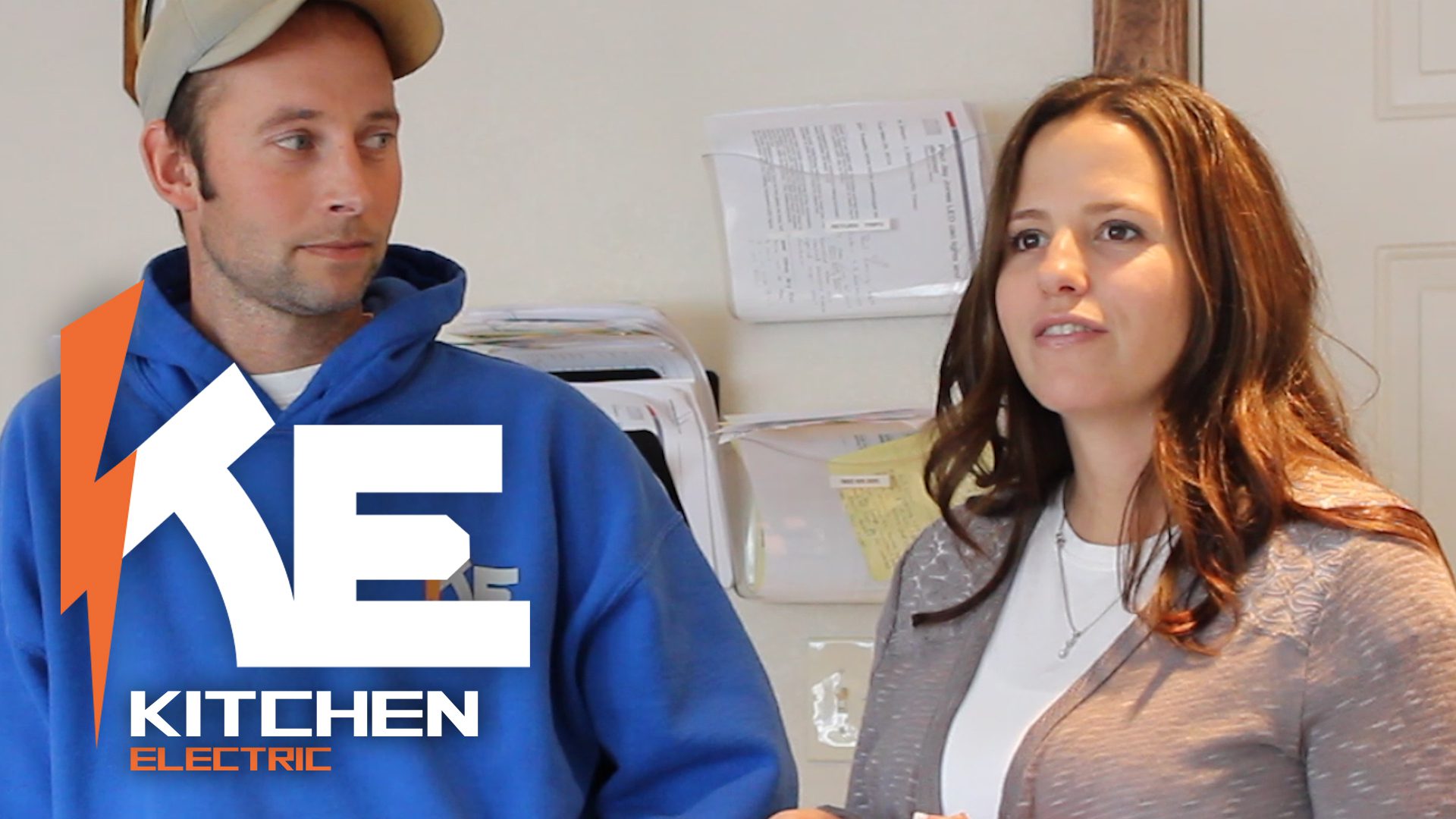
Now that their site has been up and running for a few months, we asked Paul and Sara Kitchen, owners of Kitchen Electric in Washougal, WA to share their experience of having a website built by Workshed.
Thank you Paul and Sara for sharing your thoughts! Here is a more comprehensive account of what we did for them.