Three Essential Elements of Websites for Mutual Funds
If you are one of the asset managers who are still wondering if a quality website is worth the investment, consider this: the internet is often the first place advisers and investors will learn about your firm. Given this new reality, and the value of just one adviser relationship, it’s critical to not overlook the value of a website as an asset gathering tool.
Do More
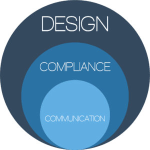
It’s not enough to just be a great asset manager anymore; your website and social media presence have to be as well thought out and executed as your investment strategy. To be effective, websites for mutual funds must excel in three crucial areas: communication, compliance, and design. If any element is missing, the site likely won’t convert your visitors into clients.
Communication
First and foremost a great website needs to communicate with advisers in a way that moves them closer making an allocation in your fund. The images, words, and videos used should be consistent with the experience one would get from meeting in person.
Compliance
Staying compliant in a dynamic regulatory environment is essential. Unfortunately, managers often assume it’s too difficult to communicate well AND stay within the regulations. This is especially true of social media. But, the compliance hurdle can also be a strategic advantage for the funds that are able to successfully communicate compliantly.

Design
Compliantly communicating, even if done well, will fail if not presented with good design. Layout, colors, typography, and navigation are just a few of the design elements to be considered. A well built website will look good, function well, and convert visitors into future clients.
Does your website measure up?
You may not manage billions of dollars (yet), but that doesn’t mean your website should look like it was designed by lawyers. Not sure where to start?
Sign up for the Workshed Website Audit.
We’ll provide you with tips for improving your website.
Workshed is uniquely positioned to build websites for mutual funds that integrate your firms online and offline brand while maintaining regulatory compliance in a way that successfully connects you with advisers and investors.
Have questions?
EMAIL JOE
