YouTube does a lot of things well, and most of the time it’s a handy way to get a video on your website. One area where they fall short, is the way embedded videos look. As designers, we spend a ton of time making sure a web site looks great, then BAM! embed a video and it all goes to hell. Colors, controls, fixed widths, and settings (like showing related videos of your competition at the end of a video) all conspire to ruin a beautiful thing.
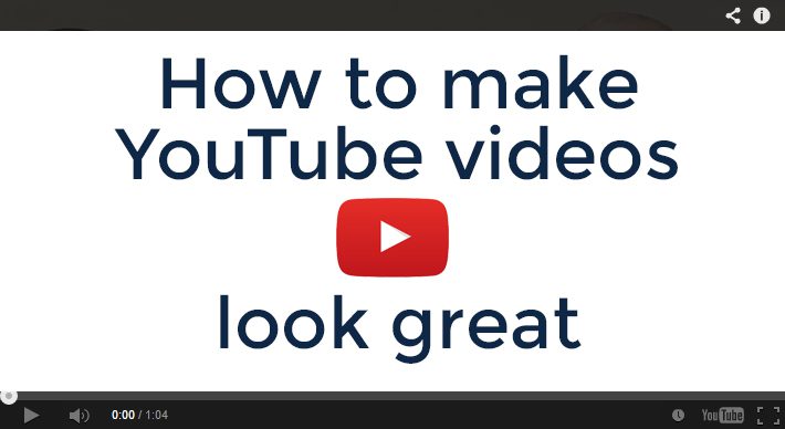
The standard YouTube embed looks like this:
Fortunately, there are ways to modify the way embedded videos look and function. The only thing we can’t do with YouTube parameters is make the video embed responsive, but that can be handled with some clever CSS (Here’s a post by Rachel McCollin that will explain how to make iframes responsive).
Another key detail to make YouTube videos look great
It would be lame to go through all the trouble to make your embedded YouTube player look good, then roll with the standard cover image that YouTube selects. Make your own custom cover photo. Not only will it look better, but it’s also an opportunity to include additional information like titles, a call to action, and your own branding.
Skip the details
If you don’t care why it works and just want the code to make it look good, add this text string to the end of the src url: ?modestbranding=1;controls=0;showinfo=0;rel=0;fs=1
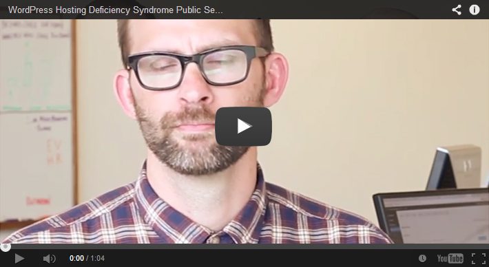
With the modified YouTube video parameters
This will hide everything and give you the cleanest looking embed by hiding the controls, eliminating the video title from the header, and removing the related videos from the end.
For those of you that like to know why
There are lots of parameters YouTube provides that allow us to modify the way videos function and are displayed, but there are 5 in particular that will handle most of what you’ll use. A complete list can be found here: https://developers.google.com/youtube/player_parameters
One last thing
One last note before diving in to the parameters; there are two important connectors that need to be included for this to work. First, you must add a ? after the last character of your url before adding the parameters. Second, separate each of the parameters with a ;. For example, the standard url for our Hosting Deficiency Syndrome Video is: www.youtube.com/embed/CFHW7jkQsZc,
to that we added the string: ?modestbranding=1;controls=0;showinfo=0;rel=0;fs=1,
giving us a combined string that looks like this: www.youtube.com/embed/CFHW7jkQsZc?modestbranding=1;controls=0;showinfo=0;rel=0;fs=1
The Big 4
Now for the parameters, with a brief explanation of how each one works. Modest Branding – This parameter controls the display of the YouTube logo. The options are 0 or 1, we almost always set it to 1. modestbranding=1 Controls – This parameter indicates whether the video player controls will display. Our options are 0, 1, or 2. Default is 1. We almost always change it to 0. If you have a video where you want the viewer to have more control leave this at 1. controls=0 Show Info – This parameter controls the display of information like video title and uploader. Value options are 0 or 1, set the value to 1 to remove the information from the video. showinfo=0 Related – This parameter indicates whether the player should show related videos at the end of your video. If you have a lot of related content, sometimes this is a good idea. More often than not it will display videos from other YouTube users, you’ll have to decide what is best for your situation. rel=0
In Closing
Whether you just want the code or the particulars, fixing how your YouTube videos are displayed goes a long way to keeping your website looking great. Hopefully this info will help make your YouTube video embeds more attractive and suck less.
T and S was in need of a better way to represent their company online. They had great service and excellent craftsmanship, but their existing website failed to communicate that message, and they didn’t have any social media presence.
To help them we built a new, easy to navigate, responsive WordPress website on the Genesis framework. Our goal was to convey their old school values in a modern way so prospective customers could find them. We took photos of Todd and Samai on the job site, capturing them as hard-working guys they are and enabling us to avoid the cheesy stock photography you see on most websites.
In addition to a new website, we set up profiles on key social media accounts to make it easy to reach customers where they are. Rounding out the infrastructure creation, we also created a custom video intro/outro and set up their smartphones so they could record updates and share them with the world within minutes.
With their new website and social media presence, Todd and Samai wanted to make sure it didn’t go unused and retained Workshed to manage their marketing. We work with them to create content like ‘how to‘ and informational videos about the services they offer.
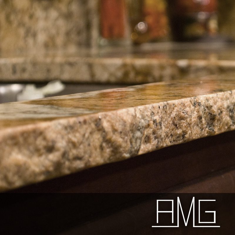
Unless you are a stone fabrication connoisseur, you may not realize the level of precision and craftsmanship that our client, American Marble and Granite or AMG, bring to their installations. I knew they did nice work because Evolutn Homes + Remodeling (Workshed Partner Brian is an owner) uses their services, but how they achieve their results is impressive. Our mission was simple: to create a website that reflects the quality and care you’d receive by working with American Marble and Granite.
Reflecting Quality
American Marble and Granite has been in business for over two decades. During that time, they’ve built a reputation based on precision installations using innovative technologies backed by outstanding customer service. Like many businesses, their focus was (is) on producing great work and their digital personality (website and social media) started to fall behind what you’d expect to see from a company of their caliber.
This is a common story for many businesses, and it’s exactly why Workshed exists. Just having a website isn’t enough, especially if the business you are in has any competition. Most of your customers are going to check you out online before making a decision. When they do, what are they going to see? What story does your website tell?
In the case of AMG, they have an incredibly sophisticated process and set of tools that they utilize on every project. For example, a routine granite kitchen would start by being laser measured and templated. To minimize the visibility of seams, the slabs then get laid out and photographically arranged before finally getting cut by a water jet machine that has tolerances into the thousandths of an inch.
Their old website didn’t effectively convey the their expertise or capacity for innovation.
Projects We Love
This is exactly the type of project we love. Client’s that are exceptional at what they do, and busy enough to need help executing an effective marketing plan for their business. In reality, a great website is just a start; it forms the basic infrastructure that is needed to support the important stuff…content.
In addition to their website, Workshed also created or “remodeled” the AMG social media presence and customized a video intro and ending to use with a series of videos they have planned (we also found a smartphone app for editing the video and combining it with the intro and ending). One of our mantras is to make it easy for the customer to do business with you, on the web that means publishing your content anywhere your customers are so they can find it. American Marble and Granite saw the value in this, and we helped deliver their vision to the virtual world.
If you are considering having granite, marble, or quartz installed in your home you’d be crazy not to give Paul and Ellen (the owners) a call. Their staff and innovative tools allow them to do countertops that other companies simply can’t, and we haven’t even mentioned they have the largest inventory of stone in Southwest Washington.


 Unless you are a stone fabrication connoisseur, you may not realize the level of precision and craftsmanship that our client,