![Recent Project: Website for Asset Manager WestEnd Advisors]()
by Joseph Graves | Mar 8, 2015 | Financial Adviser, Mutual Fund, Portfolio
New Website for RIA WestEnd Advisors
 WestEnd Advisors is an RIA in North Carolina specializing in top down macroeconomic investing. Due to the scope of work, we partnered with Ulicny Financial Communications and Strategy to revamp their old website and brand messaging.
How we Helped
There are lots of firms that design websites – some even specialize in investment manager, mutual funds, and financial advisors. Ulicny’s has deep experience in financial marketing and we posses unique insight into the investment industry. Because of our collaboration, we were able to distill WestEnd’s particular style and philosophy into meaningful messaging for each of their client verticals.
The first part of the project was to work on their brand messaging. The goal was to position the firm’s unique attributes in a way that would be attractive to the broker / dealers and Wirehouses that are their customers. Especially relevant, was the need to make a strong case to the gatekeepers at the parent firms as well as the advisors that would be allocating client assets. It was an interesting challenge to make the material sophisticated enough to gain acceptance while remaining accessible to the rank and file.
With the messaging in place, the next phase was to refresh the website. First of all, we created custom graphics and layouts that emphasized the data driven focus of the firm. Because of their multi layered strategy it required several iterations to distill into digestible nuggets, but we got it done. As a result, we kept the structure of the site simple and easy to navigate, while still being informative.
In conclusion, the success of any project is a direct result of the caliber of the parties involved. Our team of vendors, along with the clients, collaborated across thousands of miles to achieve the goals.
Websites for RIAs and Asset Managers
If you’d like to get better results from your website, digital marketing, and print communications maybe you should contact us? You’d be hard pressed to find a team better suited to grow your AUM while efficiently serving existing clients. Most of all, we love a challenge!
by Joseph Graves | Oct 24, 2014 | Workshed News
Kickstarter is Awesome, But Not Miraculous
If you have a product you want to sell, Kickstarter is a great place to start. Maybe you need funds for the initial production run, or maybe you just want to test your concept – either way it’s a great platform. There are lots of posts and books about how to run a successful Kickstarter project, but after doubling our targeted goal for SnapLaces we did a few things a bit different than what others have recommended. Obviously every project is unique, but some of the principals we used should still be valuable.
3 Simple Lessons for A Successful Kickstarter Project
- First and foremost, we worked our asses off. Running a campaign is more than a full time job, and even with people splitting the work there was still a lot to get done.
- We didn’t discount our product. Kickstarter is the one time in a products lifecycle where people might be willing to pay more just to help you out. Don’t make the mistake of discounting just to get backers. Most people underestimate what it will take to get a product to market, and even if you don’t, unexpected things can crop up.
- We contacted everyone that backed us. Literally everyone. Their responses to our questions ultimately led to valuable insights and shaped both the tone of our campaign and the direction of our company.
A Successful Kickstarter Project is A LOT of Work
The amount of work a successful Kickstarter project requires is probably the biggest reason for failure. Having successfully managed a campaign and backed several others that were not successful, I can confidently state that there is a high correlation between the effort and result. The ones that didn’t interact with backers or actively engage, didn’t meet their funding goals.
We Didn’t Discount Our Product
Many Kickstarter projects offer discounts on the product being funded. We felt like that was a bad idea, especially at the under $50 price point we were in. We knew that we’d need over 1000 backers to be successful and lowering an already small price point would add to that number. More importantly the purpose of the campaign was to raise funds to pay for a new plastic injection mold, so we reasoned that backers would be preordering our product and helping us bootstrap the effort.
One thing we did do was offer a significant discount to a limit number of early backers to gain momentum. Your first week on Kickstarter is crucial because new projects are featured and people are much more likely to discover them. The “early adopter” reward allowed us to get the required momentum to become one on the top projects on Kickstarter which led to additional backers, but the limit made sure that we weren’t sacrificing our overall funding objectives.
Communication is Key
Prior to launching we studied other successful projects and one data point stuck out. Successful projects updated an average of 1.8 times PER DAY! This is where the bulk of the work came in. In addition to sending messages to every backer and responding to their questions, we tried to post 2-3 times every day on Kickstarter, as well as maintaining an active social media presence (active as in cultivating relationships, not just carpet bombing posts) on Twitter, Facebook, Instagram, Pinterest, LinkedIn, and Google+.
Communication is the key to success on Kickstarter.
Engage and communicate relevant information to people who have helped you (or would likely help you if only they knew you existed) is the most reliable way to have a successful Kickstarter project.
What Now?
The next project will definitely be better run and more organized, but if we can save you some time and misery by sharing than it will have been worth the time invested in reading.
As always, if you have a question or comment – just ask!
by Joseph Graves | Mar 30, 2014 | Mutual Fund
Three Essential Elements of Websites for Mutual Funds
If you are one of the asset managers who are still wondering if a quality website is worth the investment, consider this: the internet is often the first place advisers and investors will learn about your firm. Given this new reality, and the value of just one adviser relationship, it’s critical to not overlook the value of a website as an asset gathering tool.
Do More
It’s not enough to just be a great asset manager anymore; your website and social media presence have to be as well thought out and executed as your investment strategy. To be effective, websites for mutual funds must excel in three crucial areas: communication, compliance, and design. If any element is missing, the site likely won’t convert your visitors into clients.
Communication
First and foremost a great website needs to communicate with advisers in a way that moves them closer making an allocation in your fund. The images, words, and videos used should be consistent with the experience one would get from meeting in person.
Compliance
Staying compliant in a dynamic regulatory environment is essential. Unfortunately, managers often assume it’s too difficult to communicate well AND stay within the regulations. This is especially true of social media. But, the compliance hurdle can also be a strategic advantage for the funds that are able to successfully communicate compliantly.
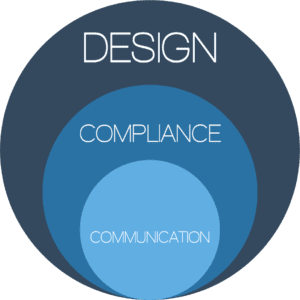
Design
Compliantly communicating, even if done well, will fail if not presented with good design. Layout, colors, typography, and navigation are just a few of the design elements to be considered. A well built website will look good, function well, and convert visitors into future clients.
Does your website measure up?
You may not manage billions of dollars (yet), but that doesn’t mean your website should look like it was designed by lawyers. Not sure where to start?
Sign up for the Workshed Website Audit.
We’ll provide you with tips for improving your website.
Workshed is uniquely positioned to build websites for mutual funds that integrate your firms online and offline brand while maintaining regulatory compliance in a way that successfully connects you with advisers and investors.
Have questions?
EMAIL JOE
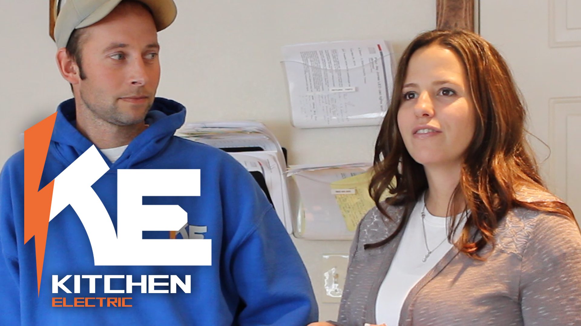
by Joseph Graves | Mar 28, 2014 | Testimonial
Great Clients = Great Projects
Now that their site has been up and running for a few months, we asked Paul and Sara Kitchen, owners of Kitchen Electric in Washougal, WA to share their experience of having a website built by Workshed.
Thank you Paul and Sara for sharing your thoughts!
Here is a more comprehensive account of what we did for them.
by Joseph Graves | Mar 27, 2014 | Marketing, Project Reports
 T and S was in need of a better way to represent their company online. They had great service and excellent craftsmanship, but their existing website failed to communicate that message, and they didn’t have any social media presence.
To help them we built a new, easy to navigate, responsive WordPress website on the Genesis framework. Our goal was to convey their old school values in a modern way so prospective customers could find them. We took photos of Todd and Samai on the job site, capturing them as hard-working guys they are and enabling us to avoid the cheesy stock photography you see on most websites.
In addition to a new website, we set up profiles on key social media accounts to make it easy to reach customers where they are. Rounding out the infrastructure creation, we also created a custom video intro/outro and set up their smartphones so they could record updates and share them with the world within minutes.
With their new website and social media presence, Todd and Samai wanted to make sure it didn’t go unused and retained Workshed to manage their marketing. We work with them to create content like ‘how to‘ and informational videos about the services they offer.